Your USSD menu design determines whether customers complete a transaction or abandon it mid-session.
In 2024, USSD captured 63.5% of total mobile money transaction volume in Africa. The continent processed $1.105 trillion in mobile money transactions that year — a 15% increase from 2023. Nine out of ten mobile money transactions in Sub-Saharan Africa flow through USSD.
The channel is massive. But a poorly structured menu turns a 30-second task into a frustrating experience users abandon before reaching the confirmation screen.
This guide gives you 10 actionable USSD menu design best practices to build interactive customer experiences that convert. Whether you’re designing mobile money flows, customer self-service portals, or registration systems, these USSD UX design patterns will raise your completion rates.
1. Respect the 160-Character Screen Limit
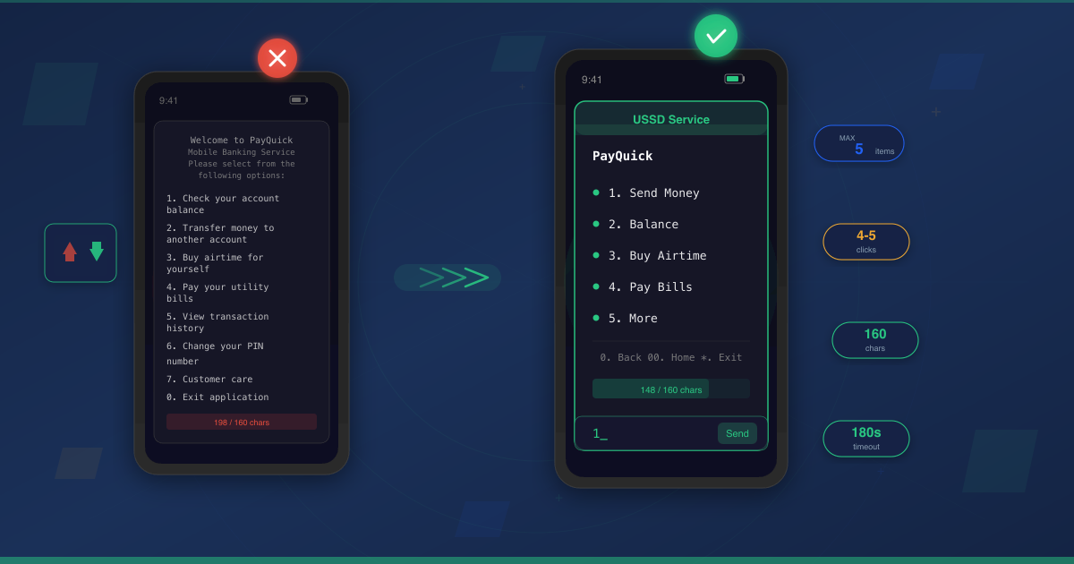
The first rule of USSD menu design is character discipline. USSD screens support a maximum of 182 characters. But not every network renders all 182 reliably.
Stick to 160 characters per screen for cross-network compatibility. This includes your menu text, option numbers, and navigation prompts.
M-Pesa — accessed via *334# by 40 million active customers in Kenya — demonstrates tight character discipline across every screen. Every word earns its place.
Here’s what that looks like in practice:
Bad — 198 characters (will truncate on many networks):
Welcome to PayQuick Mobile Banking Service
Please select from the following options:
1. Check your account balance
2. Transfer money to another account
3. Buy airtime for yourself
4. Pay your utility bills
5. View transaction history
6. Change your PIN number
0. Exit application
Good — 148 characters (fits every screen):
PayQuick
1. Balance
2. Send Money
3. Airtime
4. Pay Bills
5. History
6. Change PIN
0. Exit
Every character counts. Use abbreviations your users understand. Drop unnecessary words like “your,” “please select,” and “from the following options.”
Character-counting techniques that prevent truncation:
- Count characters in your staging environment before deployment — not in your text editor
- Include navigation prompts (
0. Back) in your character count - Test on the lowest-end device your audience uses
- Account for language variants — translations often require more characters than English
2. Keep Menu Depth Shallow — The 4-5 Click Rule
Most USSD transactions complete in 4-5 clicks within one minute. Design for that benchmark.
Deep menus kill USSD completion rates. Every additional screen is another chance for the user to get confused, make an error, or hit a USSD session timeout.
Two menu structures dominate USSD menu design: bundled and unbundled.
Bundled menus nest everything under a single entry point. The user navigates through multiple levels to reach their action. Unbundled menus surface frequently used actions at the top level.
For services users access repeatedly — checking balances, sending money, buying airtime — unbundled menus outperform bundled ones. Equity Bank’s *247#, the first USSD banking service in Africa (launched 2004), uses an unbundled structure accessible on all Kenyan networks.
Bundled (7 clicks to send money):
Screen 1: Main Menu
1. Banking
2. Payments
3. Settings

Screen 2: Banking
1. Balance
2. Transfers
3. Statements

Screen 3: Transfers
1. Send Money
2. Request Money

Screen 4: Enter amount
Screen 5: Enter recipient
Screen 6: Confirm
Screen 7: PIN
Unbundled (4 clicks to send money):
Screen 1: Main Menu
1. Send Money
2. Balance
3. Buy Airtime
4. Pay Bills
5. More

Screen 2: Enter amount
Screen 3: Enter recipient + Confirm
Screen 4: PIN
The unbundled version cuts the transaction from 7 screens to 4. That difference separates a completed transaction from an abandoned session.
3. Limit Options to 5 Items Per Screen
Five menu items per screen is the maximum for reliable display across devices.
Feature phones — still the primary device for many users across African markets — have small screens that truncate long menus. Even on smartphones, USSD renders in a basic text dialog with limited scrolling.
More than 5 options creates cognitive overload. Users scan rather than read, increasing the chance they select the wrong item or abandon the session.
If your USSD menu design requires more than 5 options, use pagination:
Screen 1:
1. Send Money
2. Balance
3. Buy Airtime
4. Pay Bills
5. More

Screen 2 (after selecting "More"):
1. Loans
2. Savings
3. Settings
0. Back
This pagination pattern keeps each screen scannable while giving you room to offer a full feature set.
4. Design for the USSD Session Timeout
USSD sessions have a total duration of approximately 180 seconds. But the real constraint is the inactivity timeout — the time a user can pause between screens before the network drops the session.
Inactivity timeouts vary by network:
| Network | Inactivity Timeout |
|---|---|
| Safaricom (Kenya) | 30 seconds |
| Equitel (Kenya) | 30 seconds |
| Airtel (Kenya) | 60 seconds |
| Other networks | 20-60 seconds |
These constraints define your design ceiling. A 6-screen flow where each screen requires 15 seconds of thought will hit the 180-second total limit. A single screen requiring complex text input can easily exceed a 30-second inactivity window.
Limit sessions to a maximum of 6 questions or interactions. Use numbered selections instead of free-text input wherever possible.
USSD session management decisions that respect the timeout:
- Pre-fill information you already know (account holder name, default amounts)
- Place the most critical information at the top of each screen
- Combine related inputs into a single screen when the character limit allows
- Show remaining steps so users know the session is almost complete
5. Implement Long Codes for Power Users
Long codes — also called USSD shortcut strings — let experienced users skip the entire menu tree and jump directly to their desired action.
Instead of dialing *123# and navigating through 4 screens to send money, a power user dials:
*123*1*500*0241234567#
This single string encodes: service (*123), action (1 = Send Money), amount (500), and recipient (0241234567). The system processes it instantly, dropping the user at the confirmation screen.
Long codes are critical for repeat users who perform the same action daily. Mobile money agents, small business owners topping up airtime, and finance teams processing payroll — these users don’t need your menu. They need speed.
If you’ve already set up a USSD shortcode for your business, long codes extend its value by giving frequent users a faster path.
When implementing long codes in your USSD menu navigation:
- Document the format clearly for end users (printed cards, SMS guides)
- Validate each segment of the string before processing — a missing parameter should return a helpful error, not crash
- Always show a confirmation screen before irreversible actions like payments
- Support partial long codes that skip some menus but not all (
*123*1#could skip to the Send Money amount entry)
6. Build USSD Error Handling That Preserves Progress
Users will enter invalid input. They’ll type “O” instead of “0.” They’ll enter an amount that exceeds their balance. They’ll dial a number in the wrong format.
Every error is a USSD completion rate risk. If your error handling sends users back to the beginning of the flow, many won’t start over.
Bad USSD error handling:
Invalid input. Session ended.
Please dial *123# to try again.
Good USSD error handling:
Invalid amount. Enter a number
between 1 and 5000:
The good version keeps the user in the same screen, tells them what went wrong, and tells them what to do next. No progress lost.
Beyond input validation, implement server-side USSD session management. Store the user’s progress on your server so that if a network disconnection drops the session, they can resume where they left off when they redial.
Session persistence flow:
- Store the user’s current screen, inputs collected so far, and timestamp on your server
- When a user redials within a defined window (e.g., 2 minutes), detect the incomplete session
- Offer to resume:
Continue GHS 500 transfer to Kofi? 1. Yes 2. Start Over - If they choose to resume, skip directly to the screen where they dropped off
This pattern is especially valuable for USSD mobile money experiences where abandoned transactions mean lost revenue.
7. Add USSD Menu Navigation Controls
Every USSD screen beyond the first should include navigation options. Users need a way to go back, return home, or exit cleanly.
Standard USSD menu navigation conventions:
0— Back to previous screen00or#— Return to main menu (Home)*— Cancel / Exit
Screen without navigation (frustrating):
Enter recipient number:
Screen with navigation (user-friendly):
Enter recipient number:

0. Back
For paginated menus, use consistent controls:
1. Savings Account
2. Fixed Deposit
3. Money Market
*. Next Page
0. Back
Consistency matters more than the specific characters you choose. Pick a navigation scheme and use it on every screen. Users learn it once and stop thinking about it.
Always include a back option on confirmation screens. Users who spot an error need a way to correct it without restarting the entire session.
8. Design USSD Menus for Accessibility and Multiple Languages
Africa’s linguistic diversity is a USSD menu design challenge and an opportunity. Ghana alone has Twi, Ga, Ewe, and Hausa alongside English. MTN MoMo supports multiple languages across 16 African countries, serving 69.1 million active users.
Language selection should be the first screen — not buried in a settings menu:
Select language:
1. English
2. Twi
3. Ga
4. Ewe
Once selected, persist the choice. Don’t ask again on the next session unless the user navigates to language settings.
Multilingual USSD design within the 160-character limit requires careful translation:
- Some languages need more characters than English to say the same thing — test every screen in every supported language
- Use universally recognized terms where possible (“OK,” “PIN,” “SMS” are understood across many African languages)
- Numbers and currency formats should remain consistent regardless of language
- Abbreviations that work in English may not translate — verify each one with native speakers
Designing for Low-Literacy Users
Approximately 250 million people worldwide live with visual impairments and approximately 1 billion with illiteracy or innumeracy. USSD serves many of these users — particularly in rural African markets where feature phones dominate.
Designing for USSD vs mobile app audiences means accepting that USSD users often include populations with lower literacy levels.
Low-literacy USSD UX design principles:
- Use short, familiar words — “Send” instead of “Transfer Funds,” “Pay” instead of “Make Payment”
- Rely on numbered choices rather than free-text input
- Keep menu labels to 1-2 words where possible
- Avoid abbreviations that require reading comprehension to decode
- Use consistent terminology — if screen 1 says “Send Money,” screen 3 should not switch to “Remittance”
Plain language benefits every user, not just those with low literacy. A menu that a first-time USSD user can navigate without help is a menu that power users can navigate even faster.
9. Place High-Frequency Actions First and Personalize
Most USSD services follow an 80/20 pattern: 80% of sessions use 20% of the menu options.
If “Check Balance” and “Send Money” account for 70% of your traffic, they belong at positions 1 and 2 on your main menu. Not buried under a “Banking” submenu.
Don’t organize menus by your internal department structure. Organize them by what your users do most often.
Organized by internal structure (wrong):
1. Account Management
2. Transactions
3. Value Added Services
4. Customer Care
5. Settings
Organized by user frequency (right):
1. Send Money
2. Balance
3. Buy Airtime
4. Pay Bills
5. More
Track usage data and reorder your menus quarterly. User behavior shifts over time, and your menu should reflect current patterns, not launch-day assumptions.
Dynamic Menu Personalization
Static menus treat every user the same. Dynamic menus adapt to individual behavior.
Personalization patterns that raise USSD completion rates:
- Frequency-based reordering: Automatically surface each user’s most-used actions at the top of their menu
- “My Favorites” shortcut list: Let users pin their top 3 actions to a quick-access screen —
1. Send to Kofi (GHS 200) 2. Buy MTN 5GB 3. Pay ECG Bill - Contextual menus: Show different options based on time of day, location, or recent activity — a payroll manager sees “Bulk Transfer” prominently on paydays
- Smart defaults: Pre-populate amounts and recipients from the user’s most recent transactions
Personalization requires server-side user profiles. Store anonymized usage patterns and apply them when the session initializes. The result: fewer screens, faster transactions, higher completion rates.
This usage-driven approach is part of a broader strategy for choosing the right channel mix — understanding how customers actually interact with each channel, then optimizing for their behavior.
10. Secure Every USSD Transaction Screen
Security-conscious USSD menu design is not optional for services handling money or sensitive data. USSD PIN entry appears in plain text on the mobile interface, subjecting users to shoulder surfing attacks.
Every financial USSD flow needs three security layers built into the menu design itself.
PIN Entry Best Practices
USSD is inherently text-based — the protocol cannot mask input characters the way a mobile app can. This creates a real security gap.
Mitigation approaches:
- Position the PIN entry as the final step, immediately before confirmation — minimizing the time the PIN is visible on screen
- Clear the screen immediately after PIN submission (send the next USSD response instantly)
- Implement lockout after 3 failed PIN attempts with a timeout before retry
- Never echo the PIN back in confirmation screens — display
PIN: ****instead
Confirmation Screens Before Irreversible Actions
Every payment, transfer, or account change needs a mandatory confirmation screen. This is both a UX pattern and a security requirement.
Good confirmation screen:
Send GHS 500 to Kofi Mensah
(0241234567)?
1. Confirm
2. Cancel
0. Back to edit
The confirmation must display: the action, the amount, the recipient’s name and number, and a clear option to cancel or go back. Never let a single input trigger an irreversible action.
SMS Confirmation Pairing
USSD + SMS creates the full trust loop. After a USSD transaction completes, send an immediate SMS confirmation with the transaction details, reference number, and support contact.
This pattern serves three purposes:
- User trust: Customers have a permanent record of the transaction outside the USSD session
- Fraud detection: Users who receive an SMS for a transaction they didn’t initiate can respond immediately
- Dispute resolution: The SMS provides a reference number for customer support
SMS confirmation pairing is standard practice across M-Pesa *334# and other major mobile money platforms. If you’re building financial USSD services, treat it as mandatory.
Bonus: Measure USSD Completion Rates and Optimize Continuously
You can’t improve what you don’t measure. Track these metrics for every USSD flow:
- Completion rate — percentage of sessions that reach the final confirmation screen
- Drop-off by screen — which screen loses the most users? That’s your first optimization target
- Average session duration — sessions approaching 180 seconds signal that your flow is too long
- Error rate by screen — high error rates indicate unclear instructions or poor input formatting
- Repeat dial rate — users dialing back within minutes likely experienced a timeout or error
Build a dashboard that shows these metrics in real-time. When you change a menu structure, measure the impact within the first week.
A/B Testing Methodology for USSD
A/B testing on USSD is straightforward, but the methodology differs from web testing.
Traffic splitting: Route a percentage of sessions to the test variant using the subscriber’s MSISDN as the split key. This ensures the same user sees the same variant across sessions. Start with 10-20% of traffic routed to the test variant.
What to test first:
- Menu item order (highest impact, easiest to implement)
- Screen wording and labels
- Number of screens in a flow (bundled vs. unbundled)
- Navigation patterns (pagination vs. submenus)
Sample size: For high-volume USSD services (10,000+ daily sessions), 3-5 days of testing gives you statistically significant results. For lower-volume services, extend to 2 weeks. Measure completion rate as your primary metric.
Change one variable at a time and measure the result before changing something else.
For a broader perspective on selecting and optimizing customer communication channels alongside USSD, consider how SMS and voice compare for different interaction types.
Build USSD Experiences That Convert With Arkesel
Designing great USSD menus is half the equation. The other half is the platform powering them.
Arkesel’s USSD Solutions deliver the infrastructure these USSD menu design best practices require:
- Multi-level menu API — build the shallow, unbundled menu structures that drive higher completion rates
- Session management — handle timeouts, reconnections, and server-side session persistence
- Real-time navigation — support back, home, and pagination controls natively
- Zero data cost — your customers pay nothing to interact with your USSD service
- Works on every phone — feature phones and smartphones alike, no app download required
- Custom USSD code provisioning — get your own dedicated shortcode for your service
Whether you’re building mobile money experiences, customer self-service portals, or registration flows, Arkesel handles the technical complexity so you can focus on the user experience.
Get started with Arkesel’s USSD Solutions and build menus your customers actually complete.
USSD Menu Design Checklist
A quick-reference summary of every USSD menu design best practice in this guide:
Screen Design
- Keep screen text under 160 characters (cross-network safe limit)
- Limit each screen to 5 menu items or fewer
- Design transactions to complete in 4-5 clicks maximum
- Test every screen on the lowest-end device your audience uses
USSD Session Management
- Account for the 180-second session limit and 20-60 second inactivity timeouts
- Limit sessions to 6 questions or interactions maximum
- Store sessions server-side for drop-off recovery
- Pre-fill known information to reduce input time
Navigation and Error Handling
- Include Back (
0), Home (00/#), and Exit (*) navigation on every screen - Return inline errors that preserve user progress — never restart the session
- Implement long code shortcuts for power users (e.g.,
*123*1*500*0241234567#)
Accessibility and Languages
- Add language selection as the first screen, not a buried setting
- Persist language preference across sessions
- Use short, familiar words for low-literacy users
- Test every screen in every supported language within the character limit
Security
- Show confirmation screens before every irreversible action
- Position PIN entry as the final step before confirmation
- Implement lockout after 3 failed PIN attempts
- Pair USSD transactions with SMS confirmations
- Never echo PINs back to the user in plain text
Optimization
- Order menu items by usage frequency, not internal structure
- Track completion rate, drop-off by screen, session duration, and error rates
- Review and reorder menus quarterly based on usage data
- A/B test menu changes before rolling out to all users
- Implement dynamic personalization for high-volume services
Frequently Asked Questions
What is the character limit for USSD menus?
USSD screens support a maximum of 182 characters. However, the recommended limit is 160 characters for reliable display across all networks and devices. This includes menu text, option numbers, and navigation prompts.
How long does a USSD session last before timeout?
Most USSD sessions have a total duration of 180 seconds (3 minutes). The inactivity timeout — how long a user can pause between screens — varies by network: Safaricom and Equitel allow 30 seconds, Airtel Kenya allows 60 seconds, and other networks range from 20-60 seconds.
How many menu items should a USSD screen have?
A maximum of 5 items per screen. This prevents truncation on feature phones and reduces cognitive load. If you need more options, use pagination with a “More” option to continue on the next screen.
How do I reduce USSD session drop-offs?
Focus on three areas: keep flows shallow (4-5 clicks maximum), implement server-side session persistence so users can resume after disconnections, and use inline USSD error handling that preserves progress instead of restarting the session. Dynamic menu personalization — surfacing each user’s most frequent actions first — also reduces the number of screens needed to reach a goal.
What are USSD long codes and how do they work?
Long codes are shortcut strings that let users bypass USSD menu navigation. Instead of dialing *123# and navigating 4 screens, a user dials *123*1*500*0241234567# to encode the action, amount, and recipient in a single string. The system processes it and drops the user at the confirmation screen.
How do I design USSD menus for multiple languages?
Offer language selection on the first screen, persist the choice across sessions, and test every screen in every supported language to verify it fits within the 160-character limit. Use universally recognized terms (OK, PIN, SMS) where possible and verify abbreviations with native speakers.
How do I secure USSD transactions?
Build three layers into your USSD menu design: position PIN entry as the final step to minimize exposure time, add mandatory confirmation screens before every irreversible action (showing amount, recipient, and a cancel option), and pair every completed transaction with an SMS confirmation that includes a reference number. Implement account lockout after 3 failed PIN attempts.
Can USSD menus be personalized for each user?
Yes. Dynamic personalization reorders menu options based on each user’s behavior — surfacing their most frequent actions at the top. Advanced implementations include “My Favorites” shortcut lists, contextual menus based on time of day or recent activity, and smart defaults that pre-populate amounts and recipients from past transactions. This requires server-side user profiles but significantly raises completion rates.
Related Articles
- 7 Business Uses for USSD: Banking, Payments & More
- How to Get a USSD Shortcode for Your Business in Ghana
- USSD vs Mobile App in Africa: Which Channel Wins?
- USSD Financial Services in Africa: Mobile Money Guide
- How to Create a USSD Code: Developer Guide for Africa
- USSD vs SMS vs WhatsApp: Which Channel Wins in Africa?
- USSD Healthcare in Africa: 5 Patient Services, No App
- USSD Security: How to Protect Mobile Transactions from Fraud
- USSD Shortcode Provider Ghana: Buyer’s Checklist (2026)
Ready to build USSD services that deliver higher completion rates? Talk to our team about your USSD requirements.


